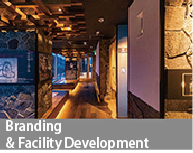
- branding
-
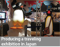
- exhibition-event
-
branding
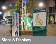
Signs & Displays
Signs and Displays that Appeal to the Receiver's Emotional Memory
An overwhelmingly high-grade mind and creativity...the power you need
The accumulation of the "severe environment where results are always required" imposed on Neospaces has led to
the development of a new business model.
It has led to the ability to bring new designs to the world.
The Power of Words / The Power of Design
Abstraction, modeling, imagination, and intuition
System building ability / Cognitive science knowledge
Infographics... design data and information.
Congruence between the form in which you express your meaning and the meaning perceived by others = transmission
The Importance of Sophisticated Icons
A memorable sign is... an unforgettable sign.
Cognition - Judgment - Action
...Actually, the human brain makes decisions before it recognizes them...
【Signs are to be experienced.】
Concept setting... Story setting
Launching force for change = Challenge...confronting the times...what's new?
Will signs and displays bring about revitalization?
NeoSpace will support you.
Facility branding, revitalization, and
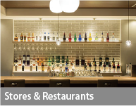
Creation of presentation space for products and businesses.
Utilize the characteristics of the target facility and PR points.
Space production design
Concept setting - Creating a high-grade space
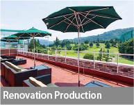
〜We have a wide range of services, from presentation planning to production.
We provide consistent support.
Sagamiono Lobby Five
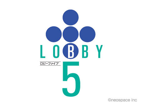
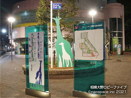
Commercial facility consisting of several buildings of different shapes and sizes.A signage system with a strong originality was set to create not only a sense of overall unity, but also a bright and new image of the city.
A new V.I. is set up that is consistent with a facility with mainly service-oriented tenants composition.The symbol color and symbol mark are renewed and the original pictogram is newly established based on the emerald green color that symbolizes the facility.The concept visual was created by superimposing the animal families, each with their own unique twist on child-rearing, on the lifestyles of the many families who live here.In addition, a stage with digital signage named "LOBBY5 VISION" is set up.The simple environment setting has created a variety of uses.
Kofu City Hall New City Hall C.I Sign Plan
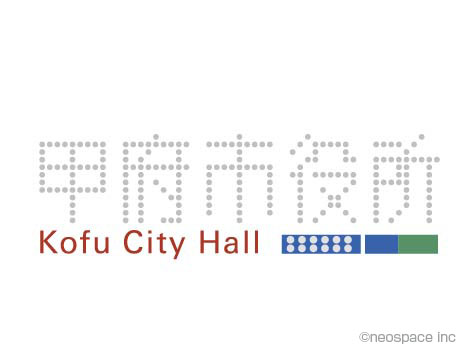
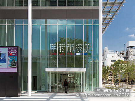
Created a enhanced concept by examining the architectural plan! Friendliness is expressed through C.I. and signage
With the construction of the new Kofu City Hall, a new logo was established to serve as the "face" of the facility.Through the construction of a meticulous signage system, the sign system creates a friendly image for the public and serve as a guide that would not cause anxiety or frustration when visiting the hall.Emphasis on universal design and bilingual notation.The logo setting was developed as a VI with a meaning linked to the architectural design, in order to dispel the administrative image of being stiff.Awarded for the Japan Sign Design Award (SDA Award).Listed in the Japan Display Yearbook.Adopted for the cover of Shinkenchiku (architecture magazine).(cl, Kofu City)
Tonohara Club (sign)
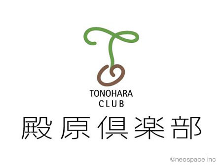
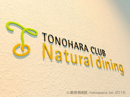
A signage system with a crisp, future-oriented logo mark based on soft lines
With the Tonohara Country Club, a prestigious short course, was renovated and newly opened as Tonohara Club, we renewed all signs in the facility, including the golf course.The initial letter "T" is expressed with soft lines in an illustration style.Added the connotation of infinity, meaning a plant germinating from a seed and infinity.The logotype is a classical typeface with active colors to create a sense of openness.Its merchandise was also unified with its whole concept.Aimed to create an image appropriate for a local community place while using a fresh color scheme that all gender would prefer.
Spa Land Hotel Naito (sign)
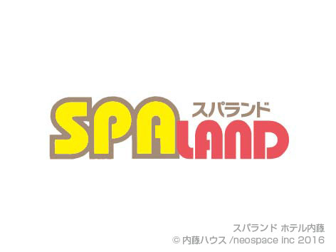
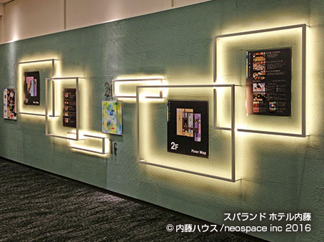
Construction of a whole building signage system for the renovation of a popular hot spring facility with the new concept of "Refresh Resort”.
Formed an unified signage plan of general information and each spot connecting hot springs facilities, dining and entertainment facilities, and accommodating facility.Created an original pictogram system that promotes sensory recognition aiming to create a facility users get to refresh themselves both mentally and physically.Setting a base color and a key visual pattern associated with “Refresh” enabled to clearly classify various kinds of signages.Formed highly visible design with universal design considerations.(cl, Naito House Co.)
Yamanashi Fruit Onsen Pukupuku (sign)

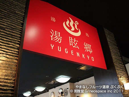
Combined signage visuals and copywriting with images of "fruit" and "wine" attributed to Koshu Hacchinka!
The keyword "Yamanashi Fruit Onsen(Hot Springs)" is an original copy.(Trademark acquired) Based on the concept of "enjoying fruits and hot springs," the facility is united with the image of "peaches, grapes, and wine" to stimulate the curiosity of urban women in pursuit of healing, beauty, and health.Public bathhouses which tend to be uniform are covered by "fun and friendly” design.The approach stairs from the adjacent fruit park are dotted with signs explaining the eight rare fruits of Koshu Hacchinka, satisfying even the most intellectual curiousity.
Fuji-san Deck ~Observatory of Light and Clouds
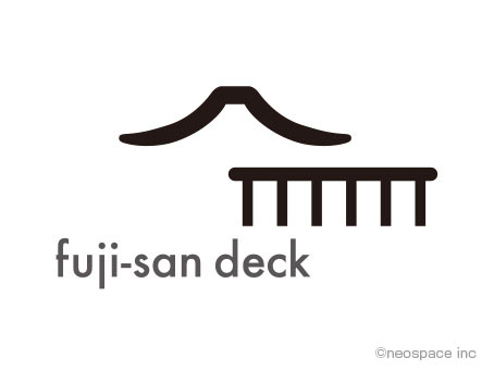
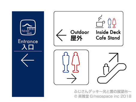
A tourism facility that is one of the best locations of Mt. Fuji, a symbol of Japan. Exhibited charms of Fuji in variety ways so that visitors can feel close to it even when it is not visible by clouds.
Provided a total planning production design to build an observatory that makes you feel surrounded by beloved Fuji.Starts with the logo that expresses Fuji and the features of the building, the signage on the "Fuji-san Deck" was designed favorable, fashionable, and cute to be not only to guide the way, but also to give visitors senses of anticipation and a special feeling with concept of “talking signage”.